MY ROLE: Content Marketing Director (in-house)
THE CHALLENGE: To support ATJ’s sustainable growth by attracting new clients
My Process
BACKGROUND
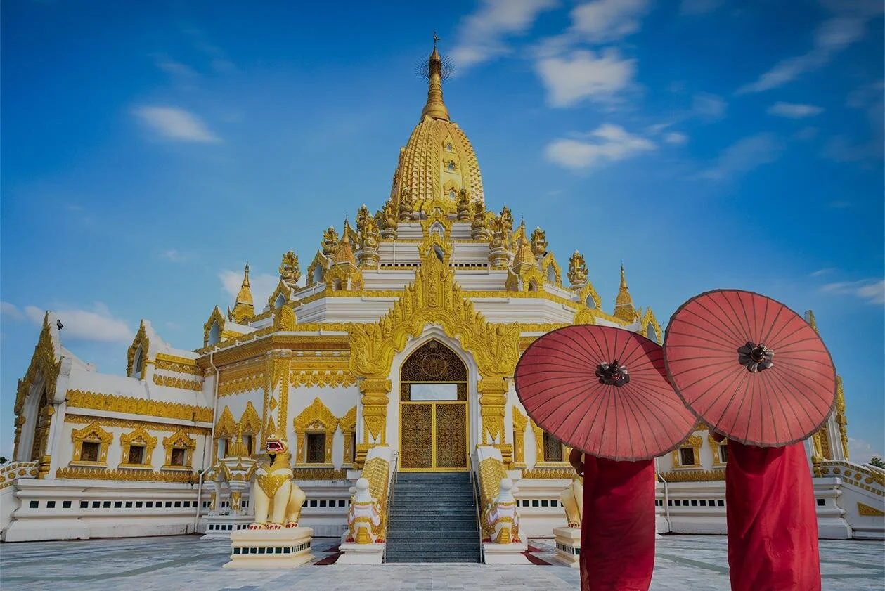
ATJ is a luxury tour operator offering bespoke and group travel packages to Asia and Pacific for English-speaking (primarily US-based) travelers. The privately-owned company had been in business for 30 years when I assumed this role, and was in the process of
SPECIFICATIONS:
I took care to think as a client and define the specific requirements for my logo:
Reflective of my design ethos: clean, intentional and distinctive
Bold color version for business card, letterhead, signage, etc.
Version that contains business name and version that does not (logo only)
Subtle grayscale version for use on client presentations so as to not overshadow the design I’ve developed for them.
Simple enough for very small or very large use to accommodate future business development (storefront, letterhead, mobile website, etc.)
BRAINSTORMING & SKETCHING:
I first began experimenting with the appearance of my initials in different fonts. I used Adobe Illustrator to outline and further manipulate the shapes. I tried a few calligraphic treatments, but found them counter to the simplicity I strive for in my design work.
I began to experiment with simple sans serif fonts in which the lowercase “j” and “r” are near mirror images of one another. I identified the curvatures and characteristics I found most pleasing.
For my brand name itself, I wanted an elegant sans serif font that conveyed my design ethos. I found this in Gill Sans and the similar web font, Lato.
REFINEMENT:
My final design for the j/r glyph was inspired by an amalgam of various sans serif fonts to represent both the “j” and “r” symmetricallyThe large block formed by the middle of the j/r combo seemed very heavy and I began to play with the “l” glyph to break up this area. Eventually, I settled on an “l” formed by negative space of equal weight to the j and r stems.
FINAL PRODUCT:
I was pleased with the simplicity and distinctiveness of my new logo. Using this logo on client presentations has proved beneficial in immediately establishing a professional impression and setting the tone for the simple, thoughtful design my clients can expect from me.
PROJECT TAKE AWAYS: This project forced me to reflect on the client/designer relationship and adopt more empathy for the client’s role in the design process.
In this case, I needed to force myself to think from very different perspectives in order to embody the client role and the designer role. As a client, I needed to clearly state my requirements and preferences to the designer. This helped me to understand how difficult it can be to identify, let alone voice, these opinions in a clear and concise manner.
As I work with clients in the future, I am inspired to spend more time nurturing our relationship and asking questions until we both deeply understand the vision.